The app had to work during night feeds, sleep deprivation, and moments where attention was already stretched.
A baby tracker designed for exhausted parents
Ajay is a personal baby tracking app I created after the birth of my son, designed to make important care information quick to record and easy to recall later.
TL;DR
- Background
- Ajay focuses on fast, low-effort baby tracking for tired parents who need reassurance and a reliable memory of recent care activity.
- Approach
- Create a focused experience centred around reassurance rather than analytics.
- Outcome
- Created a focused baby tracker designed around recording information quickly, sharing it between parents, and making it easy to review when needed.
Live side projectPrimary signal
Shared trackingProject evidence
24-48h recallDelivered outcome
01 · Problem
The problem behind the brief.
I wanted Ajay to focus on a few main abilities so it did not overwhelm us as parents during 3am feeds and night wakings. The goal was not to find patterns or predict what would happen next. It was to record what had happened quickly, without visually stimulating images or unnecessary distractions, so we could answer questions from health visitors or look back over the last 24 to 48 hours with confidence.
A feature-rich tracker could create more work for tired parents instead of reducing the mental load.
Focus the product on reassurance and quick recall rather than analytics, prediction, or visual stimulation.
02 · Research
Parents are often using the app while tired or distracted.
What I did
Personal experience caring for a newborn
Observation of day-to-day tracking needs
Reviewing existing baby tracking apps
What changed
Night-time use requires a simple and calm interface.
Most tracking revolves around a small number of repeated activities.
03 · Design
Create a focused experience centred around reassurance rather than analytics.
Reduce the effort required to record information.
Prioritise the most common parenting activities.
Fast care logging
Parents needed to record common events quickly while tired, distracted, or holding the baby.
Prioritised breastfeeding timers, bottle tracking, nappy logging, sleep, medication, and notes.
Naming and identity
The brand needed to feel personal without narrowing the product to maternity, breastfeeding, or one specific parent role.
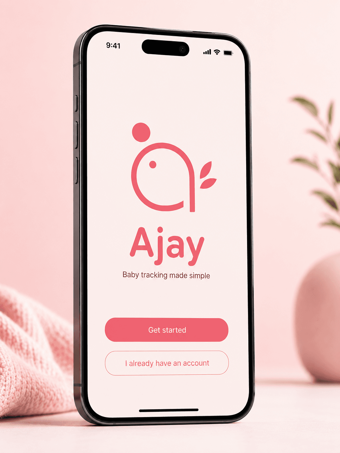
Named the app Ajay after my son's initials.
Shared family tracking
Care was shared between parents, so the record needed to be shared too.
Supported shared family accounts so both parents could contribute to the same history.
04 · Outcome
Reassurance before tracking.
Live side project
Shared tracking
24-48h recall
Created a focused baby tracker designed around recording information quickly, sharing it between parents, and making it easy to review when needed.
Built a focused tracker around reassurance rather than analytics
Created shared logging and history for day-to-day family care
Made 24-48 hour review easier when questions came up
Ajay became a practical tool for recording baby care in the moments where memory, attention, and energy were limited. The value was not in predicting behaviour, but in reducing the burden of remembering and helping parents answer important questions with less pressure.
05 · What I learned
Designing for exhausted users requires a different mindset.
The goal was not to create the most feature-rich baby tracking app.
Problem
- Problem
- Sleep deprivation makes it difficult to remember important information about feeds, nappies, medication, and sleep when it is needed later.
- Users
- New parents, particularly those caring for newborn babies.
- Goal
- Provide a fast and low-cognitive-load way to record important baby events and quickly answer questions about recent activity.
Research
Methods
- Personal experience caring for a newborn
- Observation of day-to-day tracking needs
- Reviewing existing baby tracking apps
Key insights
- Parents are often using the app while tired or distracted.
- Night-time use requires a simple and calm interface.
- Most tracking revolves around a small number of repeated activities.
Design
Direction
- Create a focused experience centred around reassurance rather than analytics.
- Reduce the effort required to record information.
- Prioritise the most common parenting activities.
Fast care logging
Parents needed to record common events quickly while tired, distracted, or holding the baby.
- Prioritised breastfeeding timers, bottle tracking, nappy logging, sleep, medication, and notes.
- Kept the core actions close to hand rather than burying them in menus.
Naming and identity
The brand needed to feel personal without narrowing the product to maternity, breastfeeding, or one specific parent role.
- Named the app Ajay after my son's initials.
- Designed the logo as a stylised jay bird that also subtly forms a lower-case a.
Shared family tracking
Care was shared between parents, so the record needed to be shared too.
- Supported shared family accounts so both parents could contribute to the same history.
- Made activity history easy to review when questions came up.
Key iterations
- Evaluated features against whether they made tracking faster or more reassuring.
- Kept the product centred on a small set of repeated parenting activities.
- Avoided features that added complexity without improving day-to-day care.
Outcome
- Built a focused tracker around reassurance rather than analytics
- Created shared logging and history for day-to-day family care
- Made 24-48 hour review easier when questions came up
What I Learned
- Designing for exhausted users requires a different mindset.
- The goal was not to create the most feature-rich baby tracking app.