Building a design system, losing it a little, and getting it back
Founding and stewarding Genio's shared design foundation, token governance and accessibility practice from November 2022 to the present.
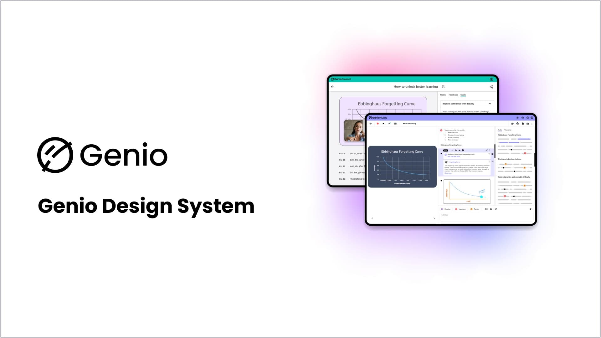
One system, multiple brands. The same foundations support Genio Present, Genio Notes and other product surfaces.
01 · Starting point
The library existed. The practice did not.
For a long time, our design system was a shared Figma library and a set of good intentions. Components were documented when somebody found a spare afternoon. Contribution meant coming directly to me and hoping I had capacity.
The foundations already existed: a style guide, a UX playbook and an early component library. But existing was not the same as working. The system had no dependable contribution route, documentation was inconsistent and design and code could drift apart.
It worked while I was available. That was the problem.
My role
I was the Senior UX Designer leading the design-system work from the design side. I set the strategy and maturity direction, established the contribution process, reviewed component quality and accessibility, maintained the design and documentation sources, and worked with engineers as shared components moved into production.
I did not create the system alone. Engineers produced the usage evidence and led implementation, while the developer I worked with brought implementation knowledge, contributed components and shared their accessibility expertise. My role was to connect that work into a coherent system the wider team could understand, use and challenge.
The system worked while I was available. That was the problem.
02 · Finding a direction
Making the gap visible.
In January 2024, an engineer approached me about properly building our shared components into code. That created an opportunity to move beyond the Figma library, but first I needed to make the gap visible rather than relying on a vague feeling that the system needed work.
We settled on a plain definition: a single source of truth for delivery, allowing teams to manage components, patterns and design guidance together. Components were the individual pieces. Patterns were groups of components solving recurring problems. Neither was particularly useful without the other.
In February 2024, I met with that developer to draw on their accessibility expertise. I brought specific questions about which requirements to document first, whether established frameworks handled accessibility better than the approaches we were considering, and whether Figma, Storybook and Zeroheight formed a sound workflow.
That conversation helped us choose React Aria rather than recreating accessible interaction patterns ourselves. We also compared Zeroheight with Supernova and challenged whether story.to.design would genuinely help keep production and design aligned.
I used a five-level maturity model to describe our starting point and direction. We were around level 2, with reusable components but limited documentation and an inconsistent relationship with code. The aim was level 3, where proven components were documented, connected to a library and embedded in product delivery.
Maturity model
Where we were, and where the strategy needed to take us.
Each product and service is designed separately. Nothing is reused.
Reusable colour and type foundations are in place.
- 2023 starting point
Some shared components exist with light documentation outside the codebase.
- 2024 direction
Most components are linked to a documented library and used in product workflows.
A fully documented system, dedicated ownership and a roadmap are integrated across workflows.
03 · Building the foundation
Quality over quantity.
The goal was never to move up the maturity model by producing the largest possible library. Quality mattered more than quantity. A smaller set of accessible, documented and genuinely reusable components was more valuable than a large collection the team could not trust.
Engineering created a usage report identifying the most frequently used components in the existing shared library. I used that evidence with designers and engineers to prioritise what should migrate, grounding the foundation in demonstrated use rather than design interest or convenience.
Nothing was built in isolation. Designers brought product context, engineers shaped feasible implementation and accessibility informed behaviour from the beginning. My role was to define and review component behaviour, make the design source coherent, document intended use and work with engineers as components moved into production.
Zeroheight became the central hub, available to the whole team rather than design alone. Documentation explained behaviour, Storybook embeds showed the production implementation and the Code tab exposed implementation details for developers.
I also introduced a contribution process so adding to the system no longer depended on somebody approaching me informally and hoping I had time. It evolved from a library maintained largely through me into a distributed practice where every squad and designer could identify needs, champion components and contribute improvements within shared quality standards.
04 · The first test
Reusable in theory was not reusable in practice.
The contribution process was tested almost immediately. In summer 2024, a product team picked up the first shared component under the new process within a day of the guide being published. It was a toolbar.
Three weeks later, a senior engineer challenged the decision. We had generalised the toolbar before demonstrating that another product would reuse it. They were right.
The process survived the disagreement, but the toolbar did not survive contact with real scrutiny. We had mistaken theoretical flexibility for evidence of genuine reuse.
That changed how I thought about the system. A component does not earn its place because it could plausibly be reused. It earns its place when repeated demand proves that it should be shared.
A component earns its place when repeated demand proves its value.
05 · Sharing ownership
The system could not remain in my head.
A design system could not succeed if its operation remained in my head. In November 2025, I walked a colleague through how the documentation was structured, how Storybook embeds worked and how developers could use the Code tab.
I also demonstrated how AI could support a first documentation draft, while making clear that generated content still needed careful editing to remain accurate, useful and recognisably written by us.
The purpose was not simply to teach somebody how to use Zeroheight. It was to distribute the knowledge and judgement required to maintain the system. Over time, contribution became part of product delivery across all squads, with every designer able to shape the library rather than treating it as something owned elsewhere.
06 · Auditing the system
Growth had introduced drift.
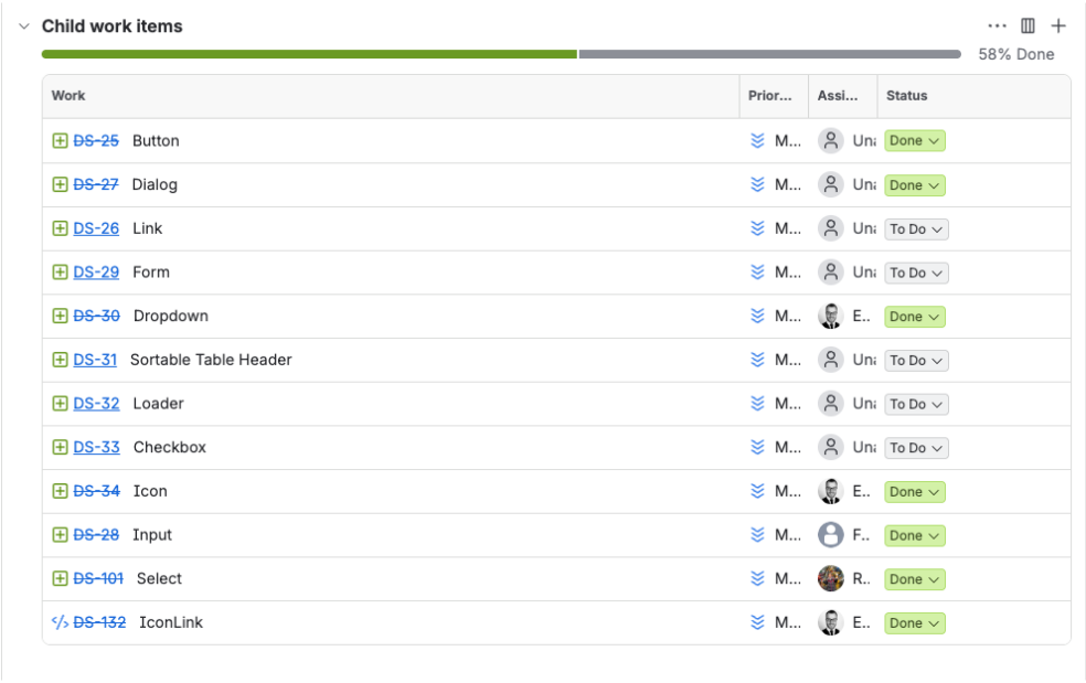
By January 2026, the system had grown, but growth had introduced drift. I audited every component, recording whether it existed in Figma, Storybook and Zeroheight, and whether it was finished, in draft or required further work. Nothing was waved through based on appearances.
Viewed together, the results told an honest story. Some issues were small in isolation: inconsistent hover behaviour, an icon shifting when a menu opened, a date input needing rework and radio buttons with an unclear selected state. Collectively, they showed how a library loses coherence when nobody regularly checks whether its parts still work together.
The audit also forced harder decisions. The toolbar, progress bar, message component, stepper and several accordion sub-components were marked for removal. Not every component that gets added earns the right to stay.
I established clearer naming standards so component properties made sense in both Figma and code. I also introduced story.to.design so production changes in Storybook could be brought back into Figma, reducing the chance of designers using an idealised component that no longer matched the product.
07 · What I learned
A trustworthy system can remove its own mistakes.
I began by assuming that likely reuse was enough. The toolbar changed my mind. A design system is not a measure of how many components a team can produce. A smaller collection of accessible, documented and proven components creates more value than a large library filled with assumptions.
I also learned that governance is not about protecting the system from disagreement. It is about making disagreement useful. The system became stronger when I stopped treating removal as evidence of failure and started treating it as part of maintaining quality.
As our products grew in different directions, the challenge changed again. Some remained close enough to share components directly, while others deliberately explored a different visual and interaction language. We began thinking about design systems in the plural: related products sharing proven foundations without forcing every experience to look identical.
What began as one shared Figma library now needs to support a family of products that do not all want to look the same. That is a harder and more interesting problem than the one I started with.