Study Notes: designing AI that keeps students learning
I led the UX work from discovery through post-launch iteration. I framed the opportunity, designed and presented the first concepts, reshaped V1 after cross-functional critique, analysed live product behaviour and shipped an accessibility improvement in production.
My role
- I led
- Discovery framing, competitive analysis, early concepts and the scoped V1 experience.
- Wider team context
- Cross-functional critique, product positioning, naming, messaging and institutional controls shaped the work around my designs.
- I owned after launch
- Behaviour analysis and an accessibility improvement taken through to a merged code change.
01 · I framed the tension
AI could remove effort. But some of that effort was the point.
In March 2026, I wrote a discovery document to explore the problem before committing to a feature. There was real commercial pressure: customers wanted more AI capability and competitors were already offering automated notes. But matching them feature for feature created a different risk.
Our learning-science position treated organising, interpreting and revisiting information as part of learning, not simply friction to remove. Full automation could make note-taking easier while also taking away some of the thinking we wanted students to do.
I mapped the competitive space and explored three broad directions: match the market, double down on active learning, or find a hybrid where AI supported thinking without becoming the endpoint.
That tension stayed visible all the way through the work. By launch, the product was explicitly positioned as a structured starting point designed to avoid the “fluency illusion”: having notes is not the same as knowing the material.
The design question was what students would do after generating notes.
02 · I took concepts into critique
My first concept did not survive the room.
A week after the discovery work, I took two concepts into a cross-functional design session. One was an event recap with key concepts, definitions and timestamped deadlines. The other was a live recap for someone who had zoned out and needed a short summary of the previous few minutes.
The event recap was deliberately conservative. A colleague challenged it as “a bit too much of a halfway house”. Their argument had two parts: full automation could offer something more useful than a generic competitor for students who genuinely could not take notes themselves, but it was only defensible if it stayed tightly positioned as a controlled accessibility accommodation rather than a shortcut for everyone.
That distinction mattered because reducing human peer note-taking support had previously created understandable concern among disability services. Some students needed complete coverage, not a summary. A feature toggle and careful messaging gave institutions control while allowing the team to explore a deeper solution for that narrower group.
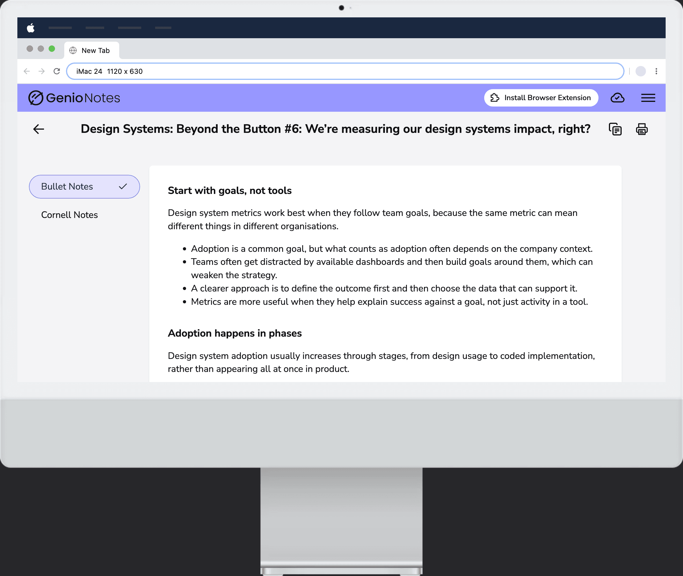
I responded by reshaping the concept. By April, I presented a more focused V1: generated notes using a clear template, transcript-grounded content, a route into Quiz Me, and practical actions such as print and copy.
The critique exposed a weakness in how I had framed the problem and helped me narrow the first release.
A useful design process should be able to prove your own idea wrong.
03 · I shaped the scoped V1
We shipped the smallest version that still taught.
My role was to turn the revised direction into a focused V1 the team could deliver with confidence. With a fixed launch window tied to an external conference, I kept the experience centred on structured, transcript-grounded notes and a clear route into further study rather than pulling every future idea into the first release.
The first release generated structured notes from the transcript and made the next study action visible. I designed the feature and worked with engineers on the prompt.
A wider product decision supported that experience: because institutional responses to AI were not uniform, Study Notes, Outlines and Quiz Me shipped behind separate feature toggles rather than one combined switch. This was team context rather than a decision I owned, but it shaped the constraints I designed within.
The wider team also tested how the feature should be positioned. I did not lead the 28-person naming study, but its findings affected the product I was designing: the most immediately appealing names could imply that AI was doing the work for the student. The final Study Notes naming balanced usefulness with support rather than replacement.
Message testing was also completed outside my direct work. “Helps you actually understand and remember the content” tested best and became part of the way the feature was introduced. I have included both pieces because they explain the positioning surrounding my design decisions, not because I am claiming ownership of them.
The first version had to give students a clear next step for studying.
Interaction detail
Short looping clip
04 · I analysed live behaviour
Early adoption became repeat use.
Within six weeks, Study Notes reached 2,526 monthly active users. That showed the feature had moved beyond initial curiosity into meaningful early adoption.
44% of users returned on a separate day, giving us a stronger signal of repeat value than a one-off generation count alone.
41% used Study Notes to turn previously untouched recordings into study notes. The feature was helping students recover learning material they had recorded but not yet used.
Students came back and used recordings they had previously left untouched.
05 · Extract text A/B test
A clearer entry point nearly doubled conversion.
We tested a clearer extract text entry point. Conversion rose from 4.2% to 8.1% (p < 0.001).
06 · Post-launch iteration
After launch, I shipped the accessibility fix.
Within two weeks of launch, I was back in the live product reviewing the details. A colleague flagged that placeholder text in the Cornell Notes template was sitting at 4.50:1 contrast, right on the WCAG AA threshold.
There was a genuine design tension: placeholder text still needed to look different from real content. I checked whether the design system already had a stronger token that solved the problem without making the placeholder visually dominant. It did.
I used AI-assisted coding to apply the stronger existing token and shipped the change as a small, focused pull request. It was a tiny change compared with the launch itself, but it is a better example of how I think about ownership: the product was live, so the work had moved from “ship it” to “keep checking whether it holds up”.
That same mindset now applies to the usage data. The feature is being used, but the drop-off between opening, generating and moving into active study is still something to investigate rather than a solved success story.
Within two weeks of launch, we found and improved a placeholder sitting at 4.50:1 contrast.